What is DesignCode UI
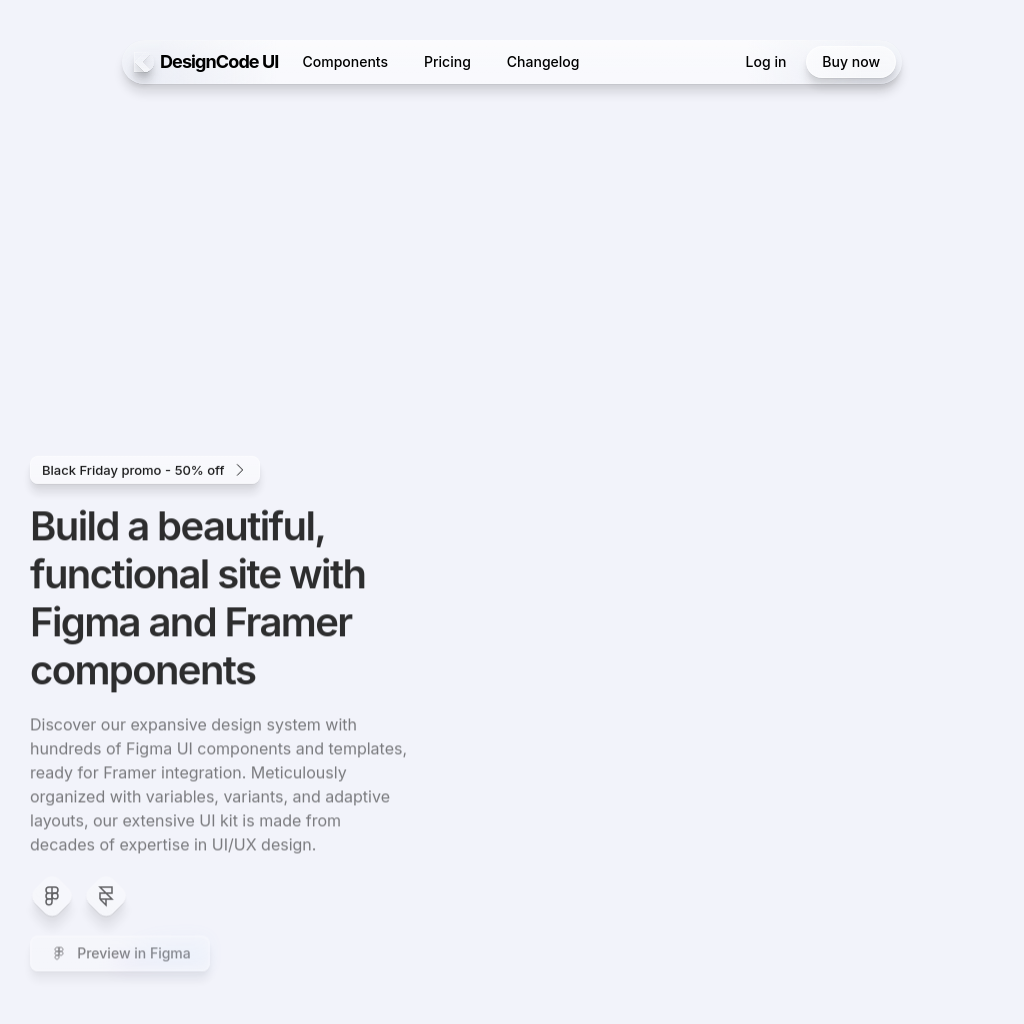
Our design system offers meticulously organized Figma UI components and templates, designed with variables, variants, and adaptive layouts. Built from decades of expertise in UI/UX design, this extensive UI kit is tailored to enhance your Figma and Framer projects.
How to Use DesignCode UI
- Integrate the Figma UI components into your Framer projects.
- Utilize the adaptive layouts and variables to customize your designs.
- Apply the provided templates to streamline your workflow and ensure design consistency.
Use Cases of DesignCode UI
This design system is ideal for designers and developers looking to create cohesive, functional, and visually appealing websites or applications. It is particularly useful for those working with Figma and Framer, offering a seamless integration of components and templates.
Features of DesignCode UI
-
UI Templates
A collection of fully designed and functional components tailored to enhance your Figma and Framer projects.
-
Smart Cards
AI-powered cards that help you track expenses, plan investments, and gain financial insights.
-
Notifications
Customizable notification components designed to keep users informed and engaged.
-
All-Access
One-time purchase with a 50% discount, offering full customization of layouts, styles, patterns, breakpoints, and icons.
-
Theming
Unique theming capabilities that allow for personalization of the aesthetic, including background, glass effects, and shadows.
-
Buttons
Customizable buttons with various sizes, icons, states, and variables to streamline your design process.
-
Controls
A wide range of controls, including segmented controls, toggles, and search bars, designed to enhance user interaction.
-
Menus & Content
Essential components like menus, popovers, navigation, and sidebars to boost your design capabilities.